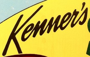
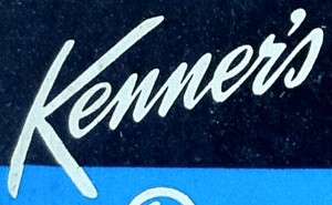
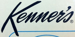
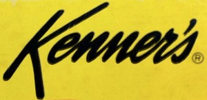
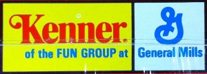
The Kenner logo has changed a lot over the years. It originally started out as a simple address line for the beloved Cincinnati based company, and ultimately became the iconic blue and white logo that we have all come to know and love. I have attempted to gather as many Kenner logo variations that I am aware of.
The dates listed with the logos are the dates printed on the corresponding toy package. This does not mean the logos were first used in that year. In some cases the differences between the logos are very slight, and may even be due to slight variations in the printing process.
If you have any Kenner logo variations that are not present here, I would love to add them. Please let me know! Here are the many different Kenner logo variations over the years:
If you have a Kenner logo or a usage variation that isn’t shown, we would love to hear from you! Just let us know by contacting us here.


